Graphic Design
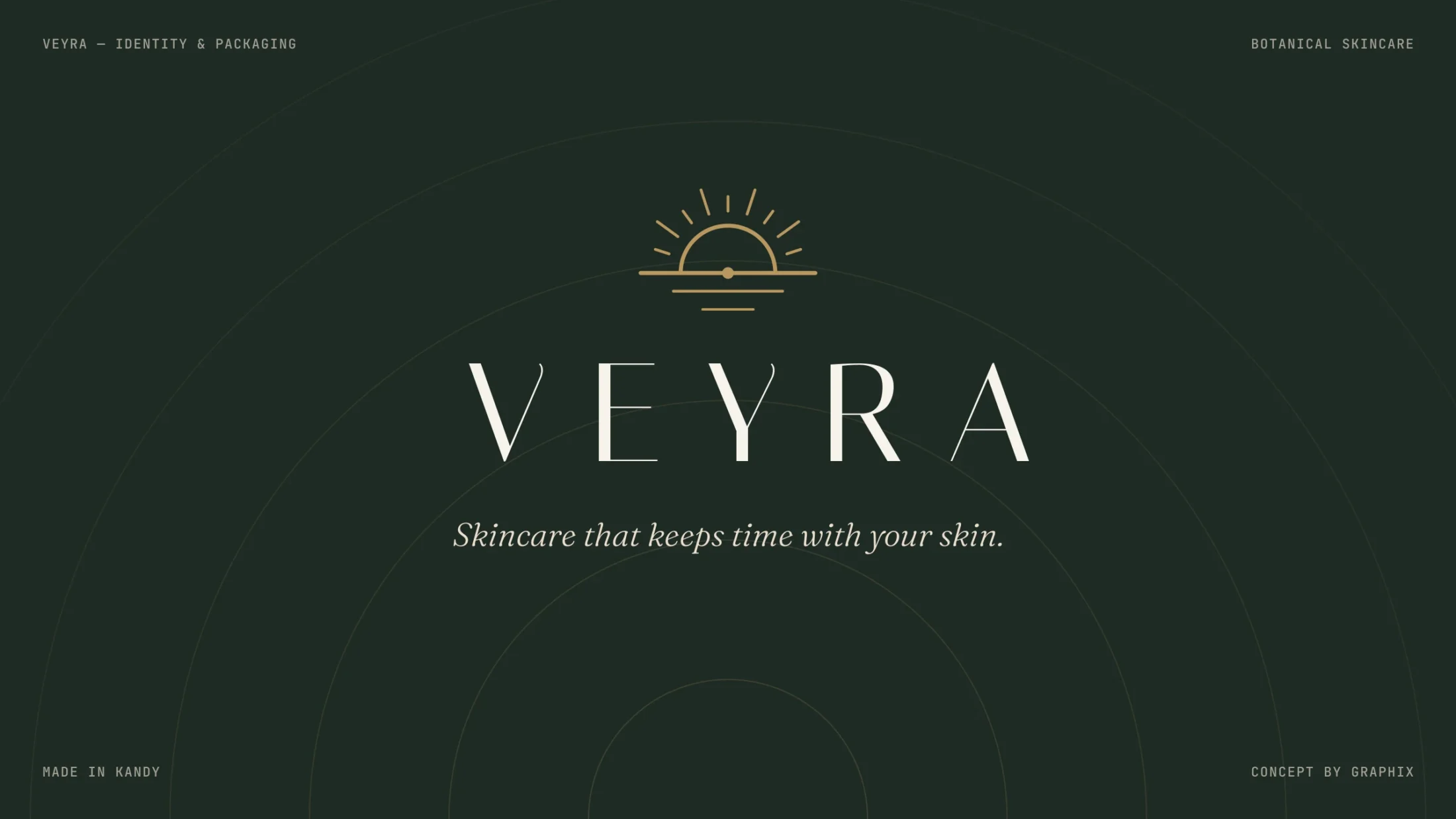
Veyra
Skincare that keeps time with your skin.
- Client
- Self-initiated concept
- Services
- Graphic Design
- Industry
- Beauty
- Year
- 2026
- Timeline
- 6 weeks
The idea
Luxury does not need to shout. Veyra speaks quietly, like early morning light — thin type, deep moss and a single gold sunrise.
01/ Brief
Natural, but not believable
Veyra is a concept for a botanical skincare line made in Kandy. Natural skincare shelves are full of leaves and green clichés. The brand needed to feel calm, premium and trustworthy, without another leaf logo.
02/ Idea
A sunrise, not a leaf
A fine-line sunrise mark and a wide, airy wordmark set on deep moss, sage and sand. Bottles, jars and tubes share one quiet layout, so the range looks like a set on any shelf or feed.
Design process
From the first conversation to a finished brand book: research, strategy, mood, the mark itself, then every place the brand has to live.
Calm, thin and wide.
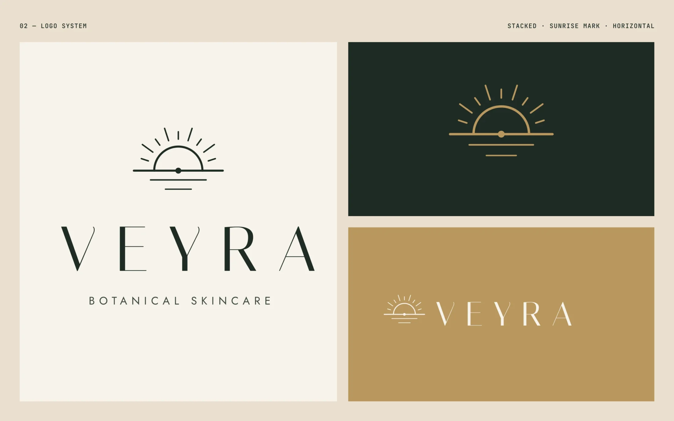
01 Logo system — stacked lockup, sunrise mark and horizontal lockup
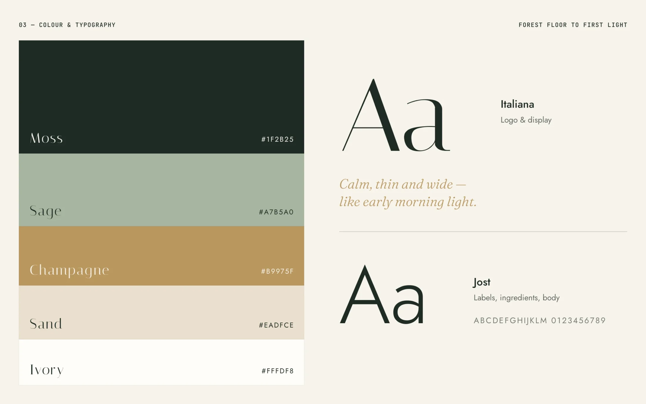
02 Colour palette and typography
Typography & colour
The brand in use
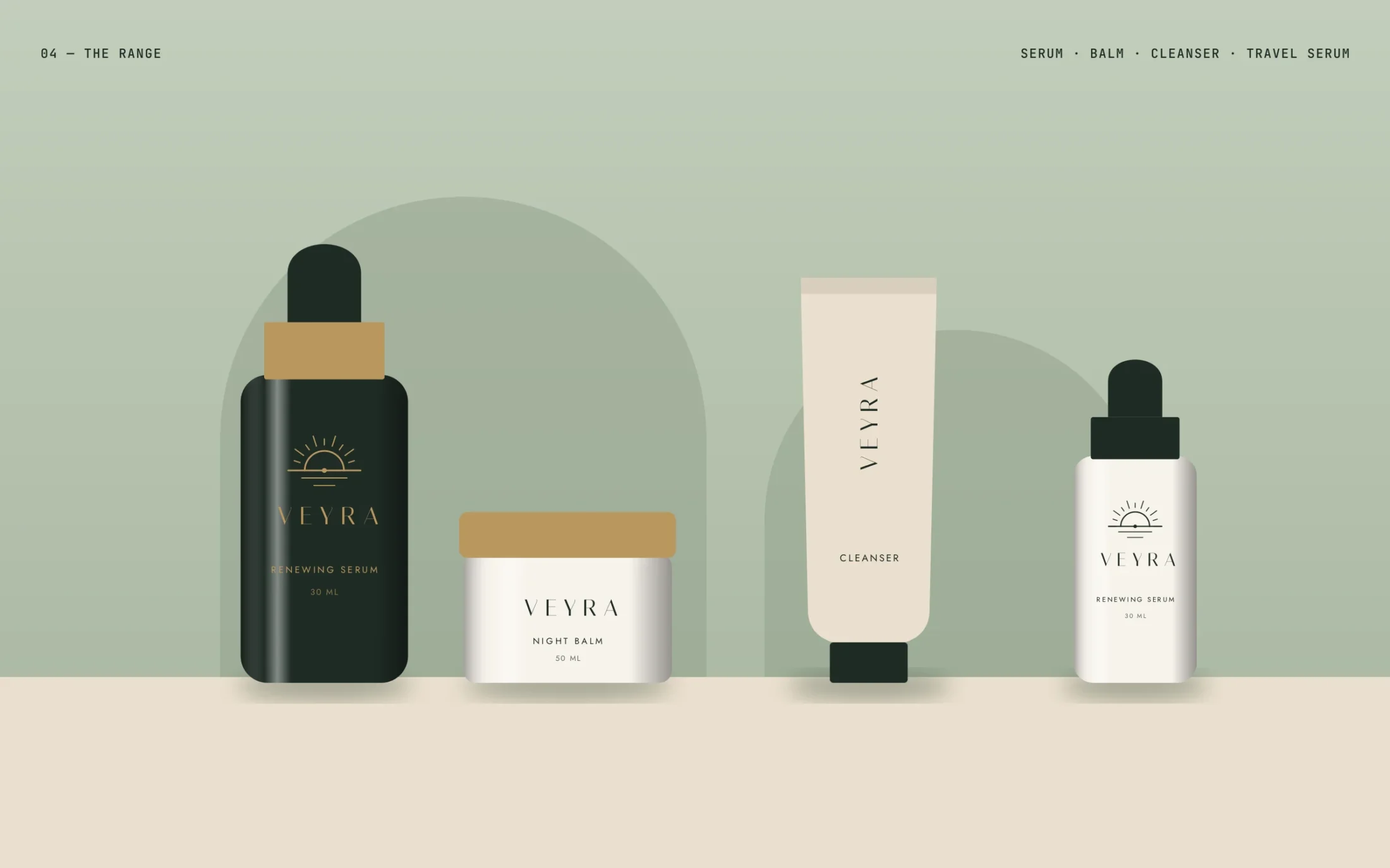
03 The range — serum, balm, cleanser and travel serum

04 Social — launch posts

05 Paper bag and business cards
Thanks for scrolling.