Graphic Design
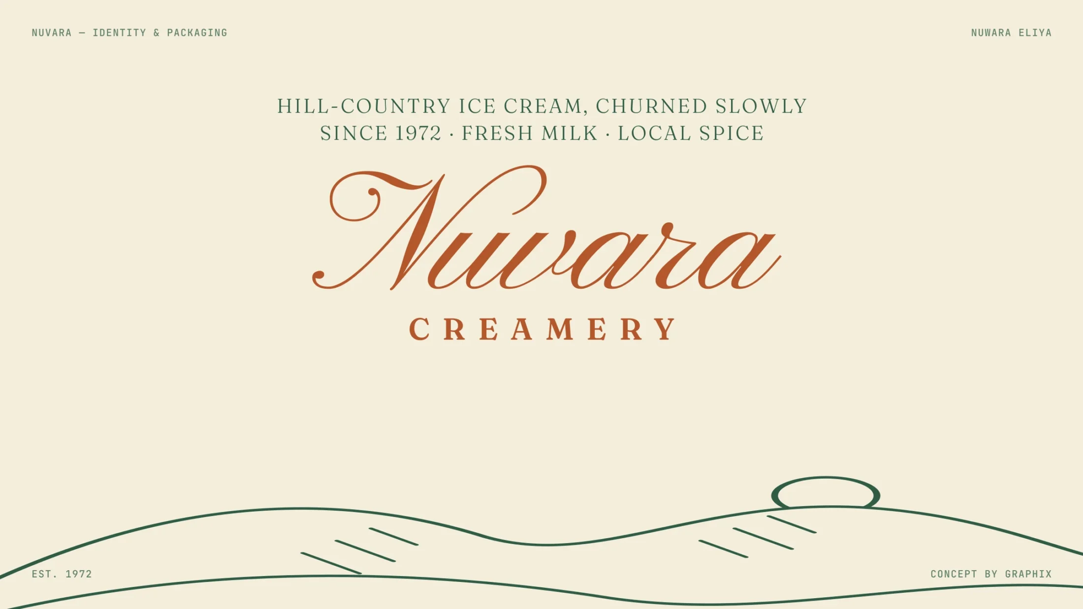
Nuvara Creamery
Hill-country ice cream, churned slowly.
- Client
- Self-initiated concept
- Services
- Graphic Design
- Industry
- Food & drink
- Year
- 2026
- Timeline
- 6 weeks
The idea
Some brands are new; this one should feel like it has always been there — a seal you trust, scooped in the hills since 1972.
01/ Brief
Heritage, hidden in a freezer
Nuvara is a concept for a hill-country creamery with a long family story. On a crowded supermarket freezer, its tubs looked like every other brand. The packaging had to show heritage and local flavour at a glance.
02/ Idea
One seal, a colour per flavour
An engraved seal with the hills, a script name and a ring of hand-set capitals. The seal sits on every lid, and each flavour — Ceylon Tea, Kithul, Wood Apple — gets its own colour, so the range reads like a shelf of postcards.
Design process
From the first conversation to a finished brand book: research, strategy, mood, the mark itself, then every place the brand has to live.
Engraved hills, hand-set type.
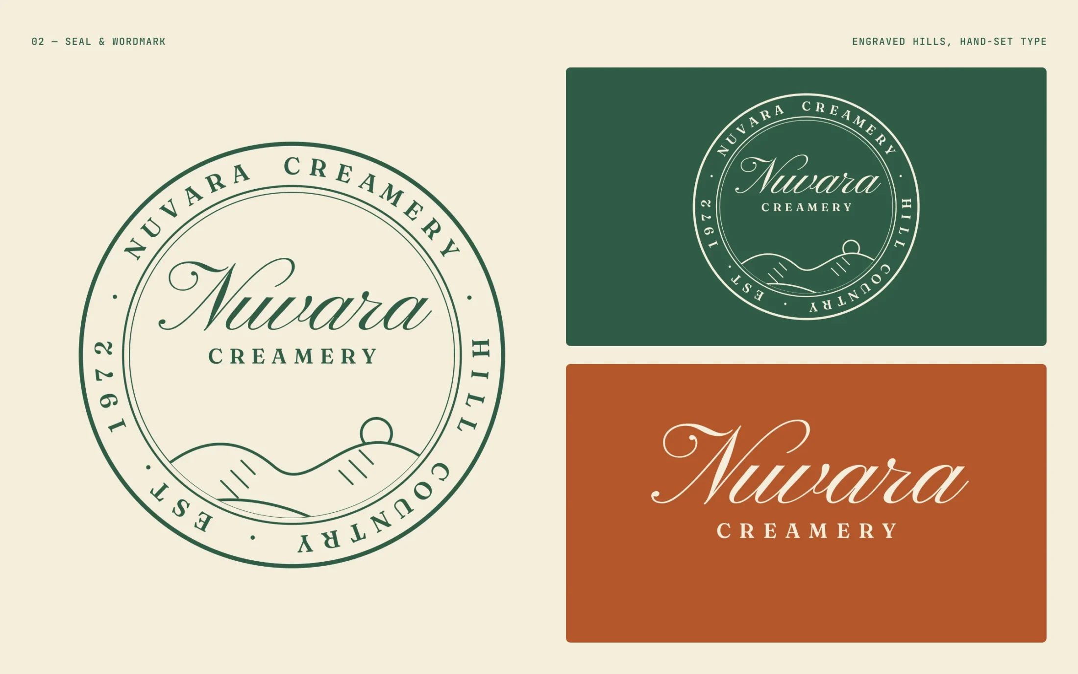
01 Seal and wordmark
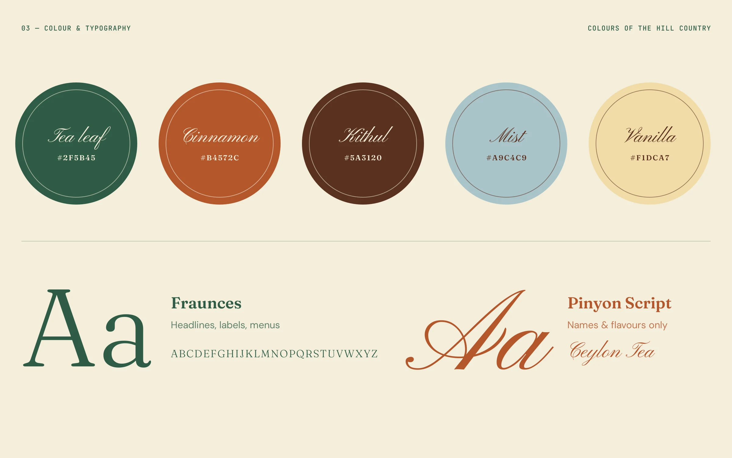
02 Colour palette and typography
Typography & colour
The brand in use
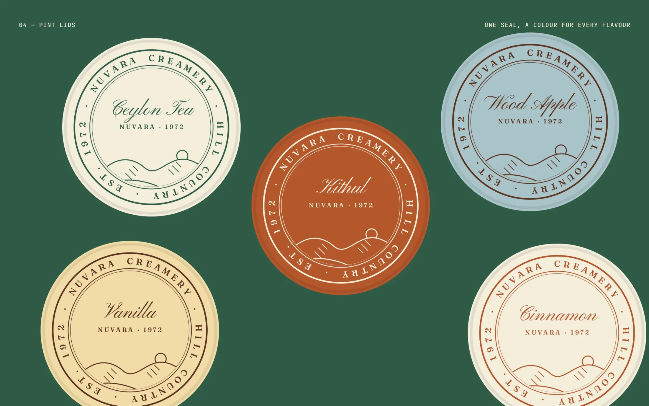
03 Pint lids from above — one seal, a colour for every flavour
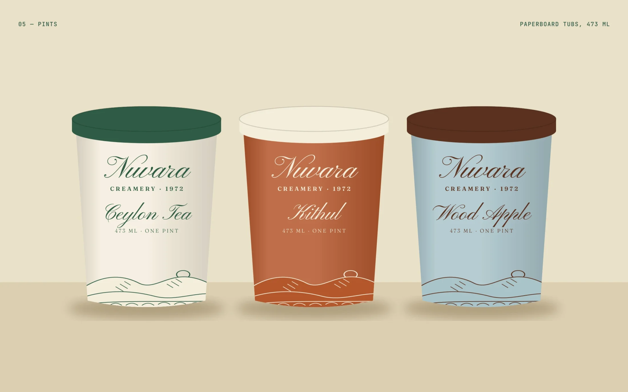
04 Pints — 473 ml paperboard tubs
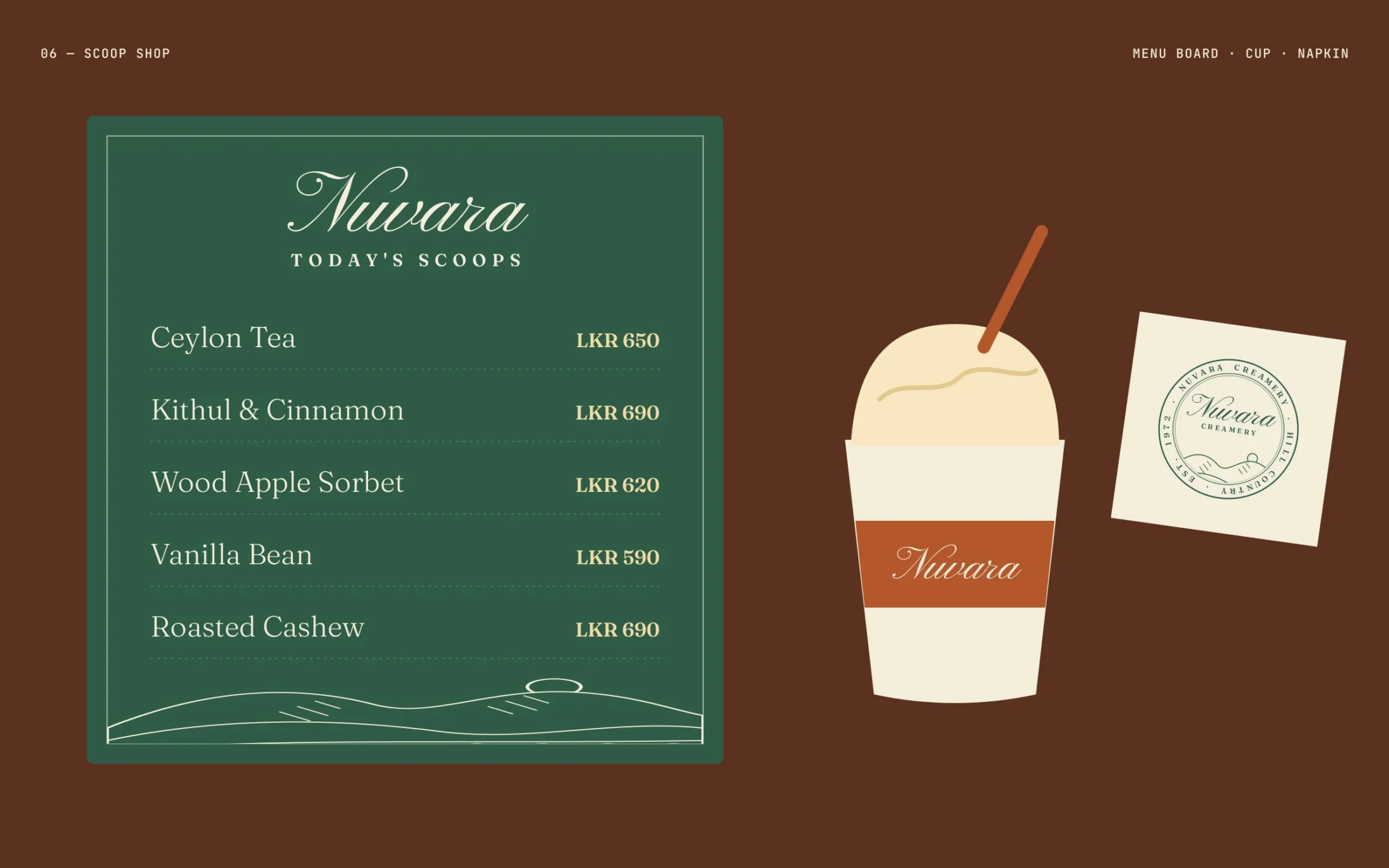
05 Scoop shop — menu board, cup and napkin
Thanks for scrolling.