Graphic Design
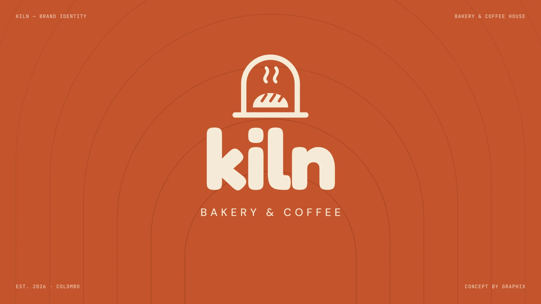
Kiln
A neighbourhood bakery that feels warm from the oven.
- Client
- Self-initiated concept
- Services
- Graphic Design
- Industry
- Food & drink
- Year
- 2026
- Timeline
- 6 weeks
The idea
A bakery brand should smell like bread before you open the door — warm colours, round letters and a mark you could draw with flour.
01/ Brief
Good bread, no story yet
Kiln is a concept for a Colombo bakery and coffee house. It needed a name, a mark and packaging that feel handmade and friendly — and still look sharp on a cup, a bag and a blade sign across the street.
02/ Idea
An oven arch, a rising loaf
The mark is an oven arch with a scored loaf and two curls of steam, paired with a soft, round wordmark. Terracotta, crust and butter tones come straight from the oven, so every cup, bag and box reads as Kiln from a distance.
Design process
From the first conversation to a finished brand book: research, strategy, mood, the mark itself, then every place the brand has to live.
Warm from the first sketch.
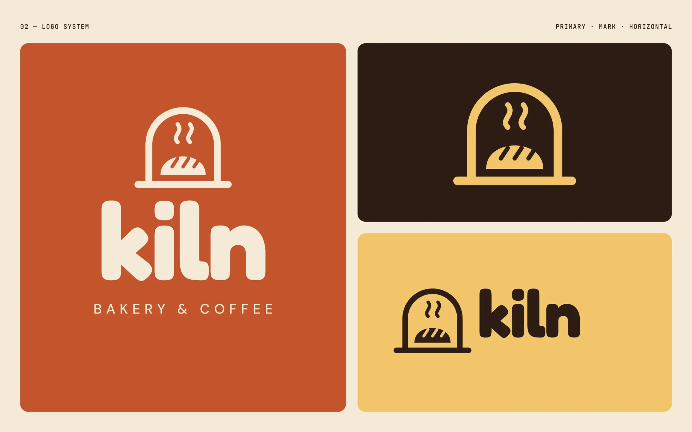
01 Logo system — primary, mark and horizontal lockups
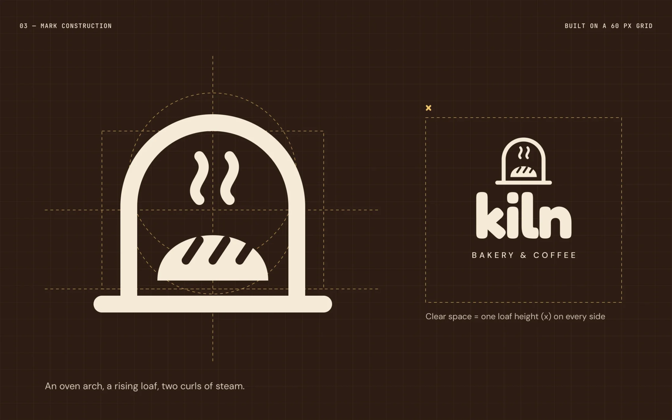
02 Mark construction on a 60 px grid, with clear space
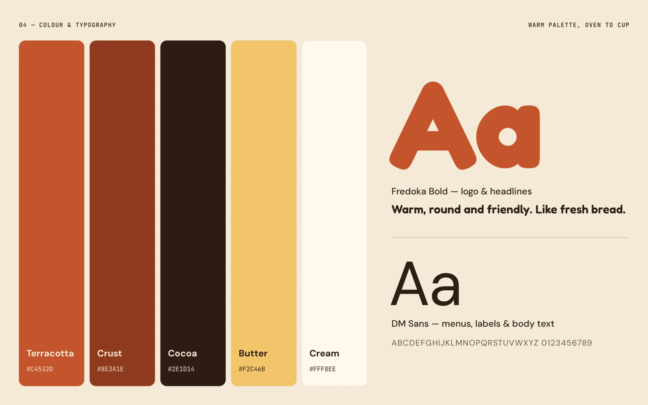
03 Colour palette and typography
Typography & colour
The brand in use
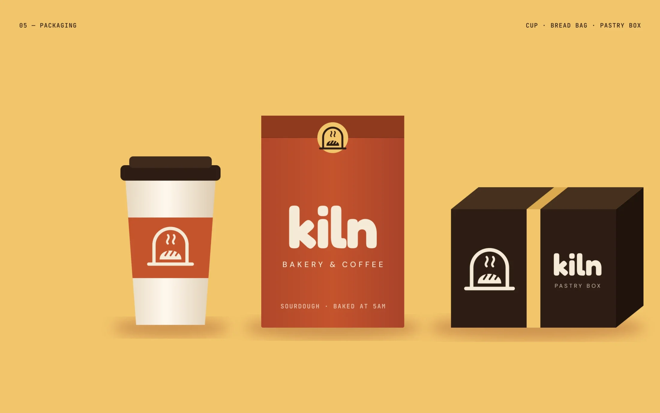
04 Packaging — takeaway cup, bread bag and pastry box
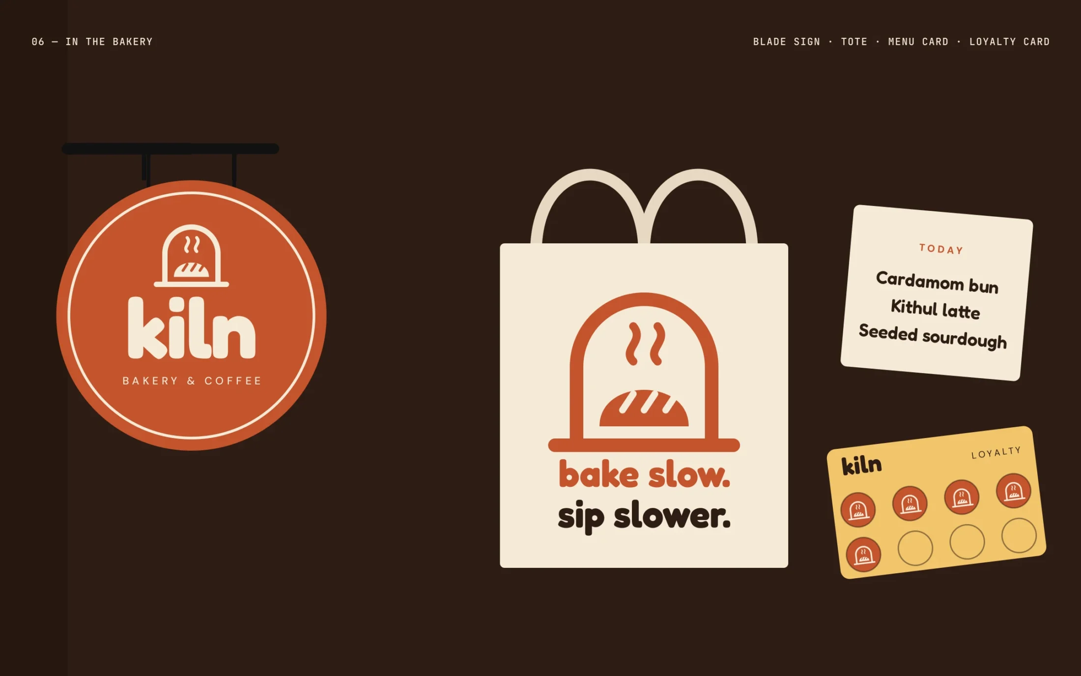
05 In the bakery — blade sign, tote, menu card and loyalty card
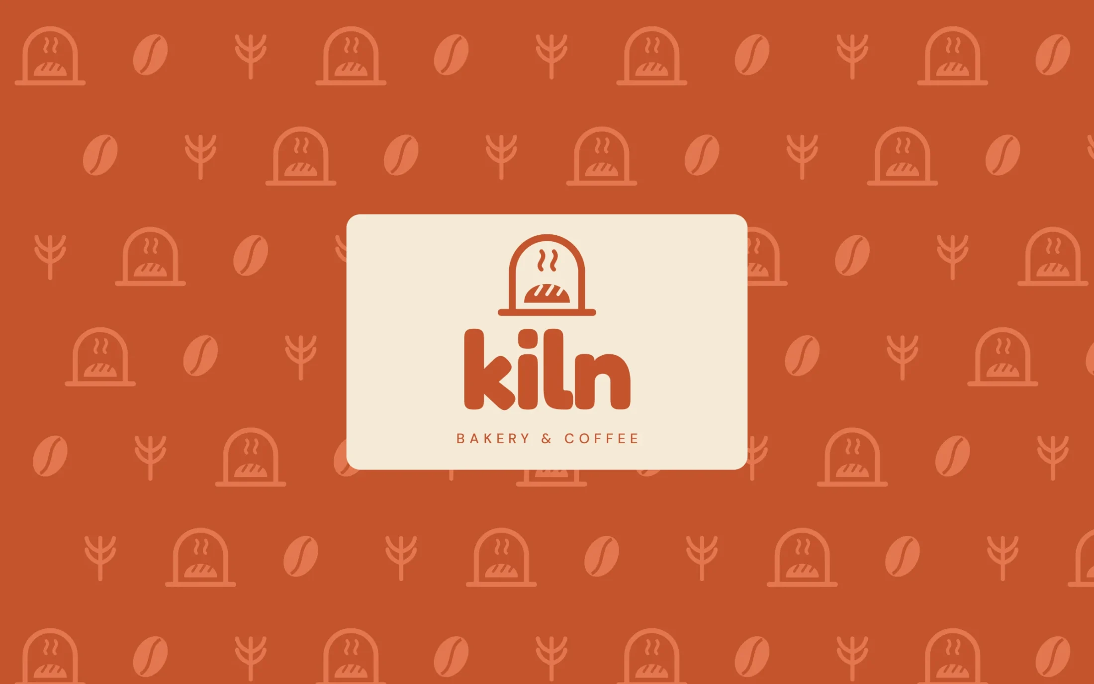
06 Brand pattern for wrapping paper and walls
Thanks for scrolling.